


Project Overview
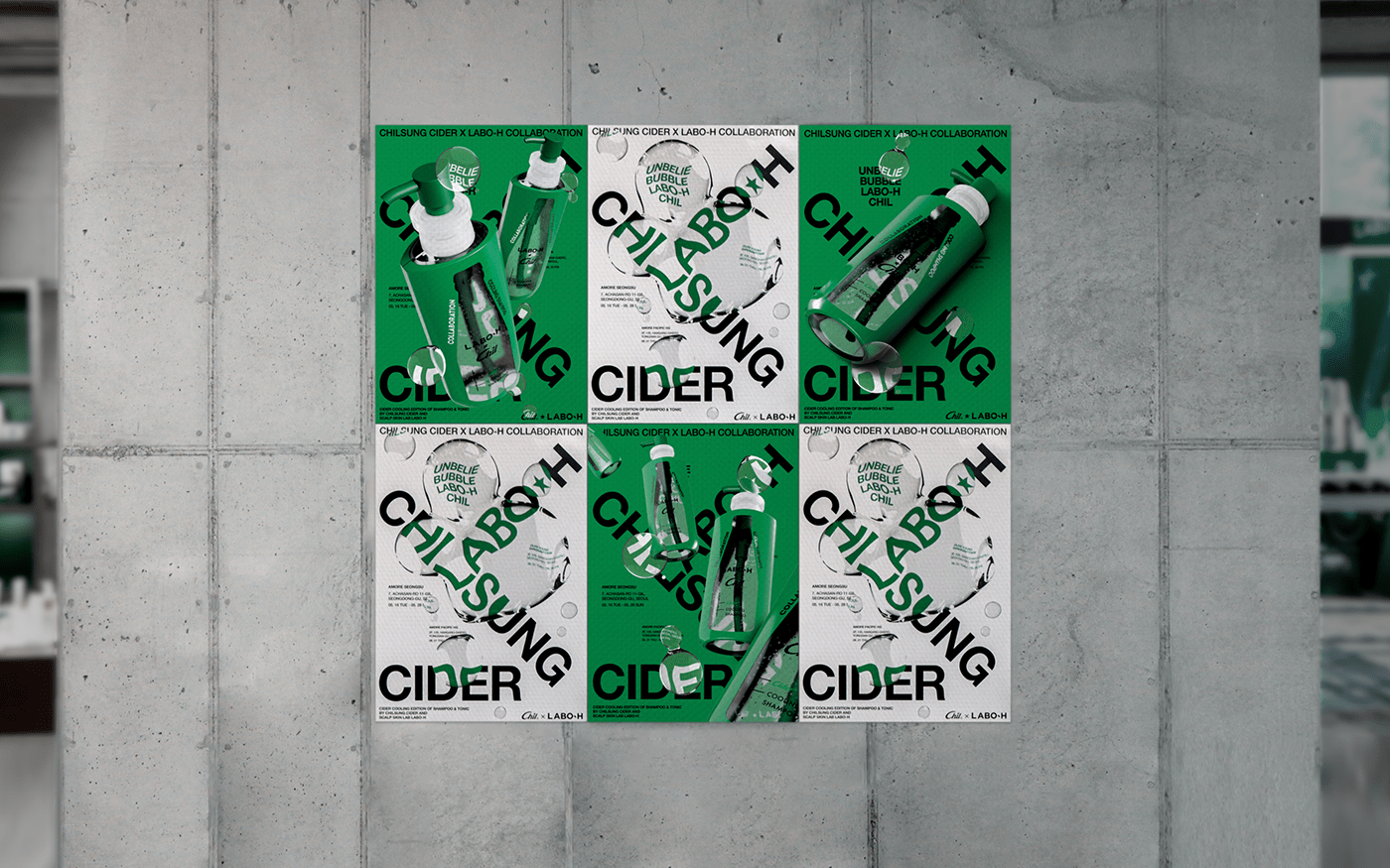
Branding agency TOMNICK initiated the collaboration project between Lotte Chilsung's Project Chil which aims to appeal to the trendy and refreshing aspects of the MZ generation while retaining the traditional classic charm of Chilsung Cider, and Amorepacific's representative scalp and skincare brand, LABO-H. Through this collaboration, the two brands resonate with each other's commonalities and intersect to penetrate the essence of scalp issues and provide solutions. The "Chilsung Cider Cooling Shampoo Edition" a product resulting from this collaboration, has been successfully launched in OliveYoung stores and both online and offline platforms, achieving positive results. Additionally, offline pop-up stores (Amore Seong-su, Busan Haeundae, Amorepacific headquarters) have been set up to enhance brand awareness among the MZ generation, receiving favorable responses.
브랜딩 에이전시 탐앤닉은 칠성사이다의 전통적인 클래식함을 바탕으로 MZ세대 타켓 트렌디함과 신선함을 어필하고자 시작된
롯데칠성의 프로젝트 칠과 아모레퍼시픽 대표 두피 스킨 케어 브랜드 라보에이치의 콜라보레이션 프로젝트를 진행했습니다.
롯데칠성의 프로젝트 칠과 아모레퍼시픽 대표 두피 스킨 케어 브랜드 라보에이치의 콜라보레이션 프로젝트를 진행했습니다.
두 브랜드는 이번 콜라보레이션을 통해 각자의 영역에서 서로의 공통점에 공감하고 교차하며 두피 문제의 본질을 꿰뚫어 보고 해결하는
"칠성사이다 쿨링 샴푸 에디션"을 올리브영 및 온오프라인 스토어에 실제 출시하여 성공적인 결과를 이루어냈으며, MZ세대 타켓 브랜드 인지도
제고를 위한 오프라인 팝업 (아모레 성수, 부산 해운대, 아모레퍼시픽 본사) 또한 긍정적인 반응을 일으키며 진행 중에 있습니다.


Design Concept
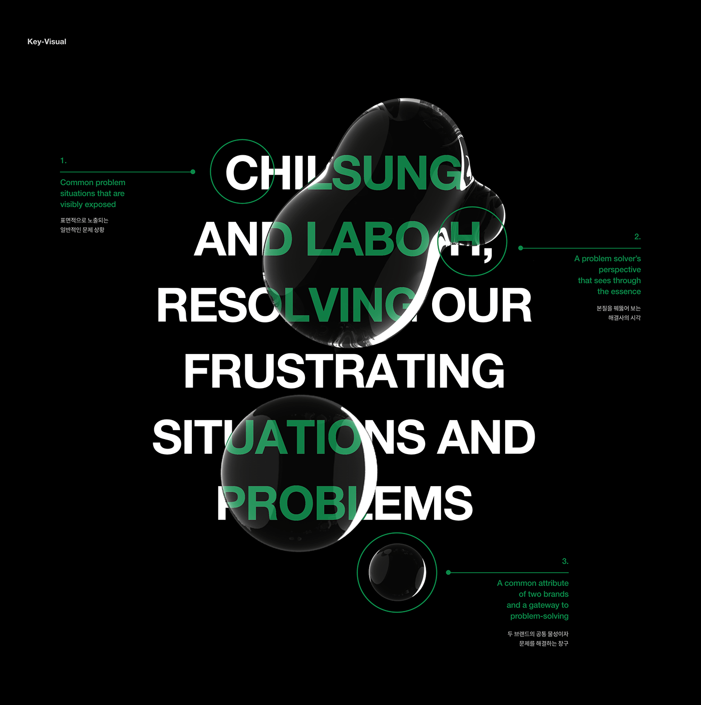
We have used carbonated bubbles as the main metaphor to visually represent the unique properties and characteristics of the key item in the project, aiming to evoke the words 'refreshing' and 'invigorating' in a simple and intuitive way. Furthermore, to establish a consistent brand image and enhance recognition, we have utilized typography design to effectively convey the subject of collaboration.
탄산 기포를 메인 메타포로 하여 프로젝트 키 아이템이 가진 고유의 물성과 특징을 심플하고 직관적으로 보여줌으로써 ‘시원함’ ‘상쾌함’의 단어들을 연상시킬 수 있도록 하였습니다. 또한, 지속적인 브랜드의 이미지 확립과 인지도를 제고를 위해 타이포그래피 디자인을 활용하여 콜라보레이션의
주체를 직관적으로 전달하였습니다.


Applications
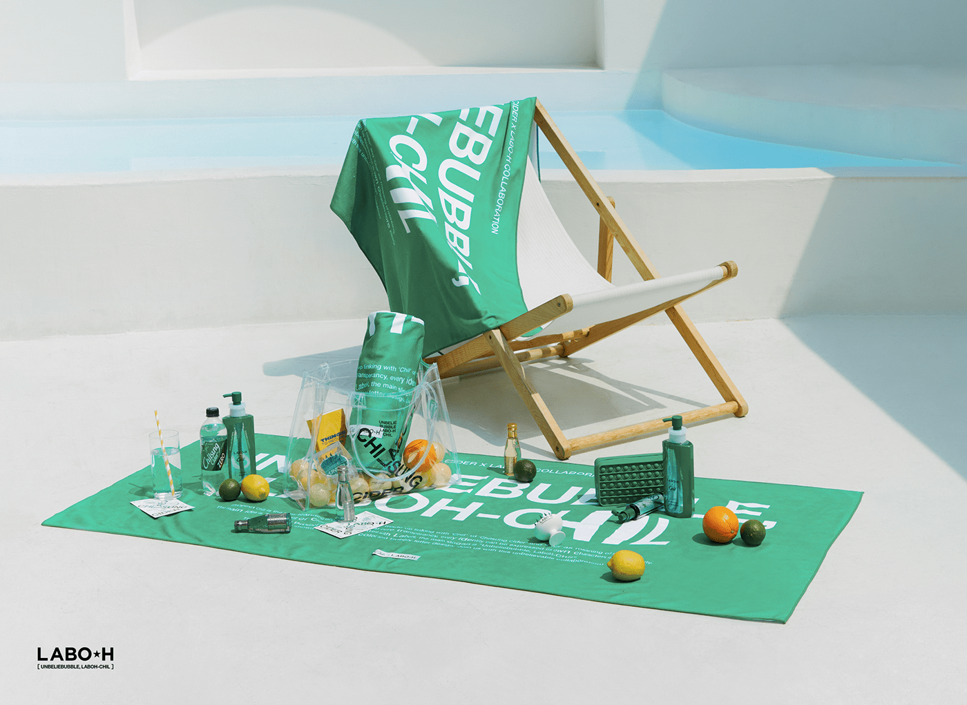
We have created beach towels, portable pouches, and transparent beach bags that are useful for water play during the summer season. These items feature the main metaphorical design of sparkling carbonated bubbles and typography, showcasing a trendy image. The vibrant green color conveys a refreshing atmosphere.
여름 시즌을 겨냥하여 물놀이할 때 유용하게 사용할 수 있는 비치타올과 어디든 들고 다닐 수 있는 파우치와 투명 비치백을 제작하였습니다.
메인 메타포인 탄산 기포와 타이포그래피 디자인이 접목된 아이템들은 트렌디한 이미지를 보여주며, 팝한 그린 컬러를 통해 시원한 분위기를
전달합니다.


LOTTE CHILSUNG & LABO-H Collaboration
Key Visual Development
TOMNICK.Inc
Strategy Director
Kim Dongwan [Tom]
Creative Director
Hong Hyundoo [Nick]
Brand Designer
Kim Dongwan [Tom]
Creative Director
Hong Hyundoo [Nick]
Brand Designer
Hwang Sunwook [Sun]
Kim Arim [Aimee]
Lee Minseok [Ethan]
Kong Hyunmin [Peter]
©2023. Tomnick Inc. all rights reserved.


